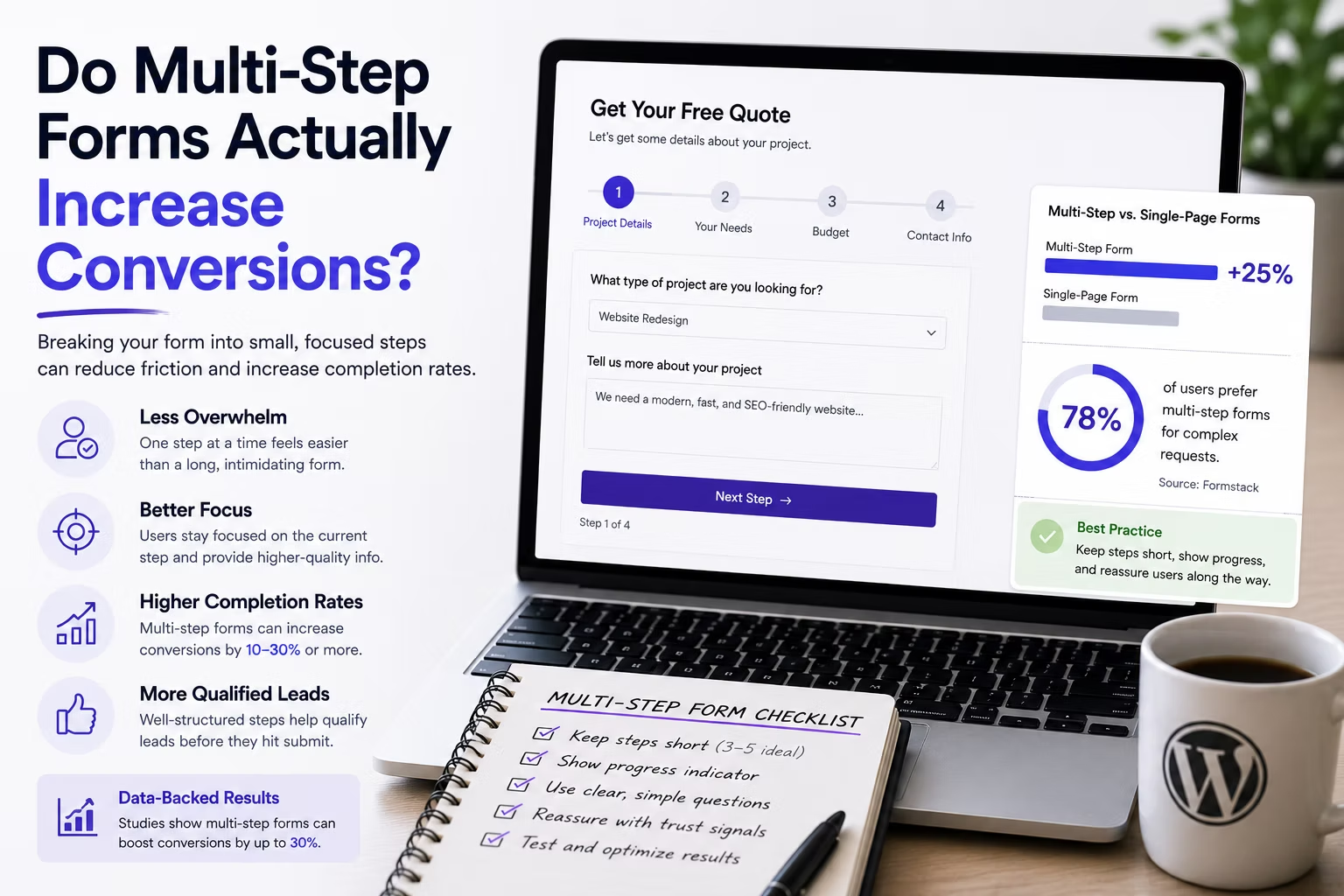
Split a long form into steps and conversions go up. That claim gets repeated in every landing page teardown, usually with a percentage attached and no source. It is true often enough to be worth trying and false often enough to cost you leads if you apply it blindly.
Here is what is actually going on, when the technique works, and how to find out whether it works on the specific form in front of you.
Disclosure: some links in this article are affiliate links. If you buy through them we may earn a commission at no extra cost to you. It does not change what we recommend.
The mechanism is psychological, not technical
A multi-step form does not remove a single field. The visitor still answers everything. What changes is what they see when they decide whether to begin.
Three effects do the work:
- Perceived effort drops. A wall of fourteen inputs reads as a chore. Three inputs and a Next button reads as a quick question, and the decision to start is the hardest one in the whole interaction.
- Commitment carries people forward. Once someone has answered two questions, abandoning feels like wasting the effort already spent. This is why the easy, low-risk questions belong first.
- Attention is focused. One idea per screen genuinely reduces mistakes, particularly on mobile where a long form means constant scrolling and lost context.
None of that helps if the form was short to begin with. Splitting a name, email and message form into three steps adds two clicks and removes nothing, and it reliably performs worse than the single page it replaced.
When it works, and when it does not
| Form | Multi-step likely to help? | Why |
|---|---|---|
| Name, email, message | No | Already trivially short; steps add pure friction |
| Newsletter signup | No | One field, one decision |
| Quote request, 10 or more fields | Yes | High perceived effort is the barrier |
| Booking with dates and options | Yes | Natural sequence the visitor already expects |
| Job or finance application | Yes | Long, and progress feedback matters |
| Checkout on a single product | Usually no | Every extra screen is another chance to leave |
The pattern is consistent. Multi-step helps when the form is long enough that its length is the thing putting people off. Below roughly six fields the overhead outweighs the benefit.
Order the steps deliberately
This is where most implementations lose the advantage they just built.
Put the easy and non-threatening questions first, and the ones people hesitate over last. On a quote form that usually means the project details come before the contact details, not after. Asking for a phone number on screen one is asking someone to accept a sales call before they have any idea what they are getting.
Two more rules earn their keep:
- Show honest progress. A progress bar or a step counter tells the visitor how much is left. A bar that jumps from 20 percent to 90 percent because your steps are uneven trains people not to trust it.
- Let them go back without losing data. Returning to a previous step must not clear what was already entered. This is the most common bug in a hand-built multi-step form and the fastest way to lose someone who was almost finished.
Both major commercial form plugins handle steps, validation and back navigation natively, which is the main argument against building this yourself. Gravity Forms has had page breaks with conditional routing in core for years, and WPForms offers multi-page forms with progress indicators. Either removes the class of bug that comes with custom JavaScript on a form a client depends on.
Measure abandonment per step, not just completions
Total completions tell you whether the change helped. Per-step drop-off tells you why, and only one of those is actionable.
Instrument each step transition as an event in your analytics, then look at the funnel. What you find is usually specific and fixable: a large fall at step three because that is where the phone number lives, or a fall at step one on mobile only because the first field triggers an awkward keyboard.
Partial entry capture is worth knowing about here. Both plugins can record what was entered before someone left, which turns abandonment from a number into a list of fields people refused to answer. Treat the data carefully, because a partially completed form is still personal data the client is now storing, and it belongs in the privacy policy and the retention schedule.
Test it rather than believing it
Run the change as a real comparison. Keep the existing form live, publish the multi-step version, split traffic, and let it run until each variant has a few hundred sessions. On a low-traffic site that may take a month, which is a good reason to be honest with the client about how long a genuine answer takes.
Two things will contaminate the result if you let them. Do not change field wording at the same time as the structure, or you will not know which one moved the number. And judge on qualified enquiries, not raw submissions: a form that produces more leads your client cannot sell to has not improved anything.
Page speed is a confounding variable as well, because a slow-loading form loses people before they see either version. If load times on the site are unresolved, fix them first using the developer breakdown of what makes a page load fast, then test the form.
The version most sites should build
For a typical service business, the form that performs best is not usually the most elaborate one. It is:
- Three or four steps, no more, on a form that genuinely has ten or more fields.
- Project or need first, contact details last.
- An honest progress indicator and working back navigation.
- No CAPTCHA unless spam has proved it is required.
- A confirmation screen that says what happens next and when.
That last point is undervalued. Telling someone they will hear back within one working day reduces the duplicate submissions that come from people who are not sure it worked, and it sets the expectation the client then has to meet. If the wider conversion picture is what you are working on, how hosting affects conversion rate covers the infrastructure half of the same problem.
Frequently Asked Questions
How many steps should a multi-step form have?
Three or four for most business forms. Two rarely justifies the extra click, and beyond five the form starts to feel like an application, which suppresses starts for exactly the reason the technique was meant to solve. Group related fields so each step is a single coherent question.
Do multi-step forms hurt SEO?
Not in themselves. The risk is technical: if steps are rendered entirely in JavaScript with no content in the initial HTML, or if each step changes the URL without proper handling, you can create indexing oddities. A form built with an established plugin avoids this because the page itself remains a normal indexable page.
Should contact details be on the first step or the last?
Last, in almost every case. Contact details are the commitment, and asking for them before the visitor has invested any effort raises the barrier at the worst possible moment. The exception is a form where a callback is the entire offer, in which case the phone number is the point.
Is capturing partial entries worth enabling?
It is genuinely useful for diagnosis, because it shows which field people stop at. Treat follow-up contact separately: emailing someone who deliberately did not finish a form is a decision with legal and reputational implications depending on jurisdiction, and it needs the client’s explicit agreement rather than your assumption.
How long should I run a test before trusting the result?
Until each variant has enough conversions to be meaningful, not until a fixed date. A few hundred sessions and a couple of dozen conversions per variant is a reasonable floor for a business site. Stopping the moment one version pulls ahead is how teams talk themselves into changes that do nothing.
Multi-step is a tool for long forms, not a general improvement. Apply it where perceived length is the barrier, order the steps so the easy questions come first, measure per step, and be willing to revert if the numbers disagree with the theory.
Need a WordPress developer?
Let's build something fast, scalable, and SEO-ready — from a custom theme to a full headless stack.
Get in Touch